Site Settings: Branding & Design
Site Settings is your design control center — colors, fonts, menu styling, buttons, and more, all with a live preview of your actual homepage right next to the controls.
Go to Site → Site Settings in your dashboard (or Design → Site Settings) to open it.
If you've used FaithMade for a while, you may remember doing this in the WordPress Customizer. Site Settings is the newer, faster replacement — same underlying settings, but with instant color updates and a cleaner layout. A few dashboard shortcuts may still say "Customize" and drop you into the old Customizer; that still works, but Site Settings is where you should make changes going forward.
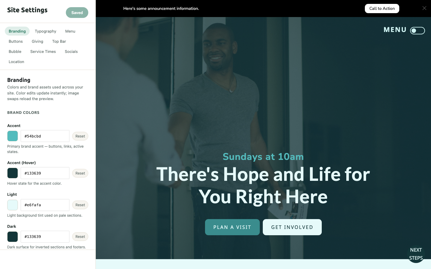
How It Works
The panel on the left has your settings, grouped into tabs. The preview on the right shows your actual homepage. Color changes apply instantly as you type or pick a swatch — no saving required to see them. Changes that affect layout (fonts, some toggles) reload the preview after you save.
What's in Each Tab
Branding — Your core brand colors (Accent, Accent Hover, Light, Dark, and a few supporting tones), plus your logo and default images used across sermons, series, groups, and events when a specific item doesn't have its own image.
Typography — Body and heading fonts, font weights, and text colors. Toggle "Customize Body Font" off to fall back to your theme's default.
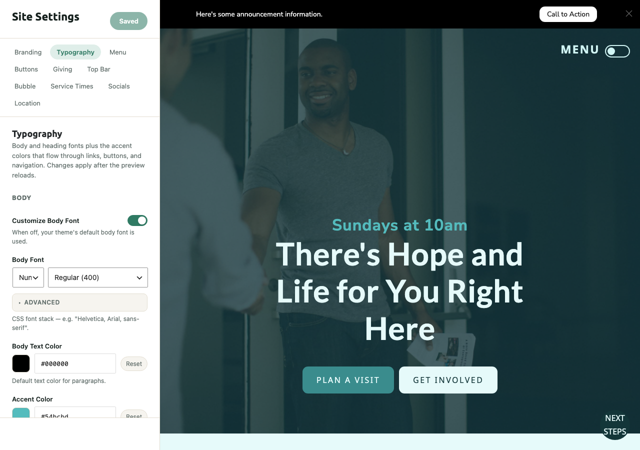
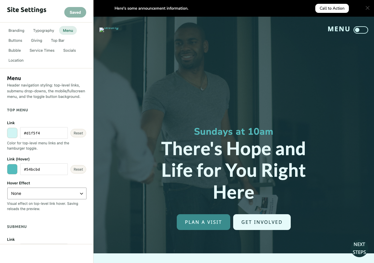
Menu — Colors and hover effects for your header navigation: top-level links, submenu dropdowns, and the mobile/fullscreen menu.
Buttons — Primary, Secondary, and Tertiary button color sets, border/shadow styles, and whether buttons "lift" on hover.
Giving — The simple giving link/embed shown on your site (a giving URL or embed code, text-to-give number, and app store giving links). If your church uses the full Giving plugin for online donations, that's configured separately — this tab is for the basic giving info shown in your header/footer.
Top Bar — The announcement bar that runs across the very top of your site: message text and a call-to-action button.
Bubble — The floating popup in the bottom corner of every page, usually used to highlight next steps or upcoming events.
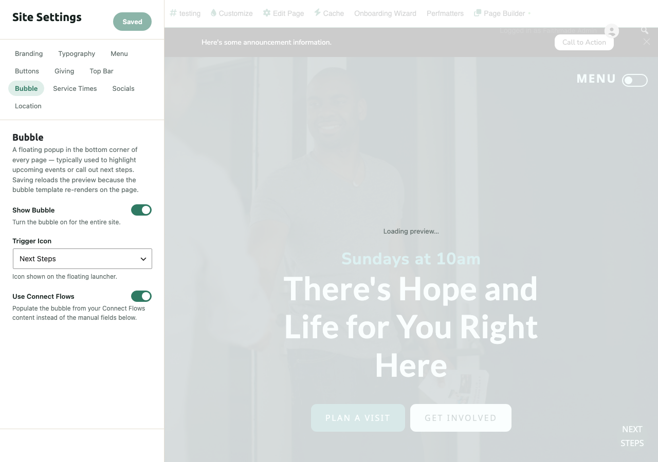
Turn it on or off with Show Bubble, pick a Trigger Icon, and choose Use Connect Flows to pull its content from your Connect Flows setup instead of filling in the bubble's fields by hand.
Service Times — The service times shown in your header/footer and structured data (helps Google show accurate hours in search results).
Socials — Links to your church's social profiles, shown as icons in your footer.
Location — Your church's address and map settings — also feeds your SEO structured data automatically, so filling this in helps your church show up correctly in local search and map results.
The Game Plan
- Start with your Brand Colors in the Branding tab
- Upload your real logo and set default images
- Pick fonts that feel like your church in Typography
- Fill in Service Times, Socials, and Location — quick wins that also improve your SEO
- Check the live preview on both desktop and mobile before moving on
- Keep it simple — the best church websites aren't the flashiest, they're the clearest
Not sure what your brand colors are? Pull them from your church logo. Most designers can give you the hex codes, or use a tool like imagecolorpicker.com to sample them directly.
Related: Choosing & Understanding Your Starter Site · Setting Up Connect Flows